Download all assets

Effective Altruism brand essentials

These are the basics for using the Effective Altruism brand: the logo, the colours and the typefaces. They’re for anyone making something that carries the EA name.

The full guidelines, covering tone of voice, imagery and templates, are on the way. Until then, if you're not sure something fits, ask us before you publish.

Logo

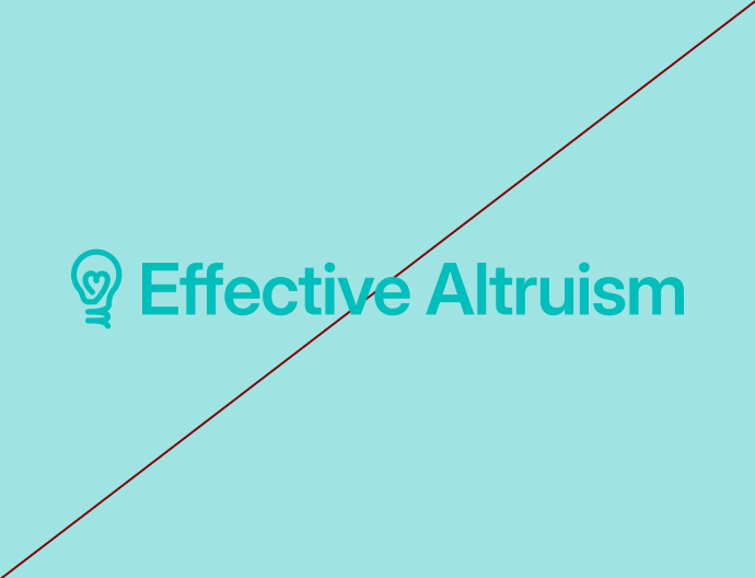
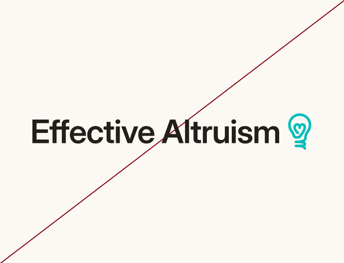
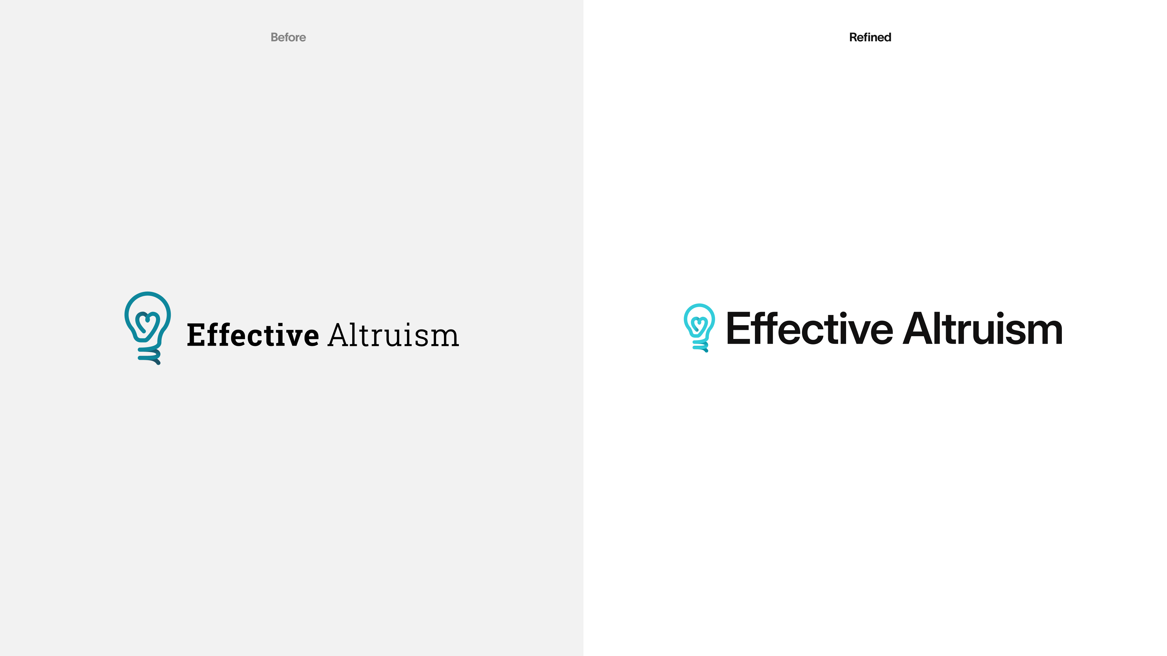
The logo pairs the lightbulb symbol with the Effective Altruism wordmark. Use the full logo wherever there's room for it. Use the other versions only when the space calls for them.

Colour

The logo comes in two full-colour versions and one white version. Don't recreate it in any other colour, and don't change the teal of the symbol.

Scaling

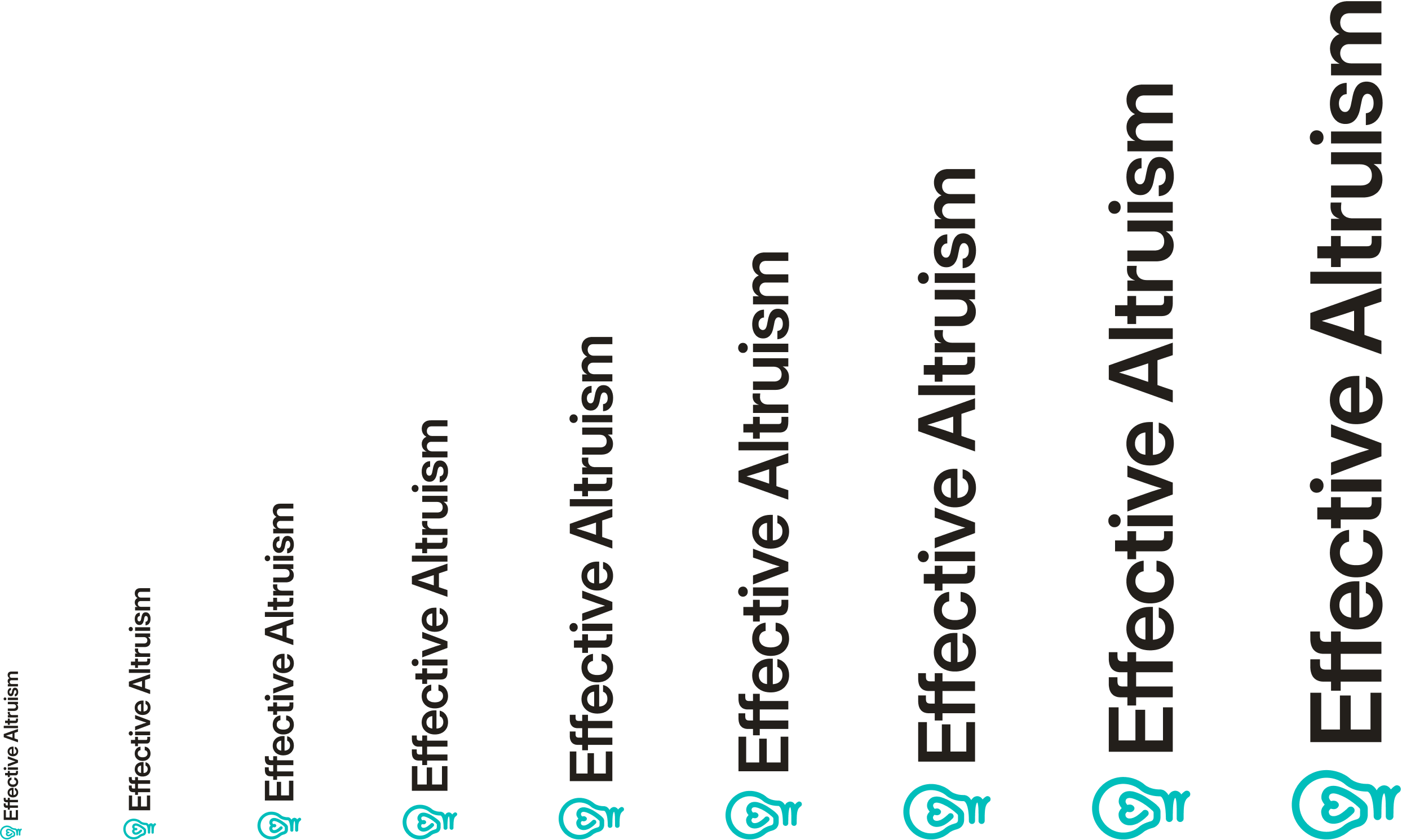
The lockup is designed to stay clear at any size, from a 20px favicon to a conference banner. Always consider the audience, the channel and the tone: at large scale it can be the whole composition; at small scale it steps back and lets the content lead.

Clearspace

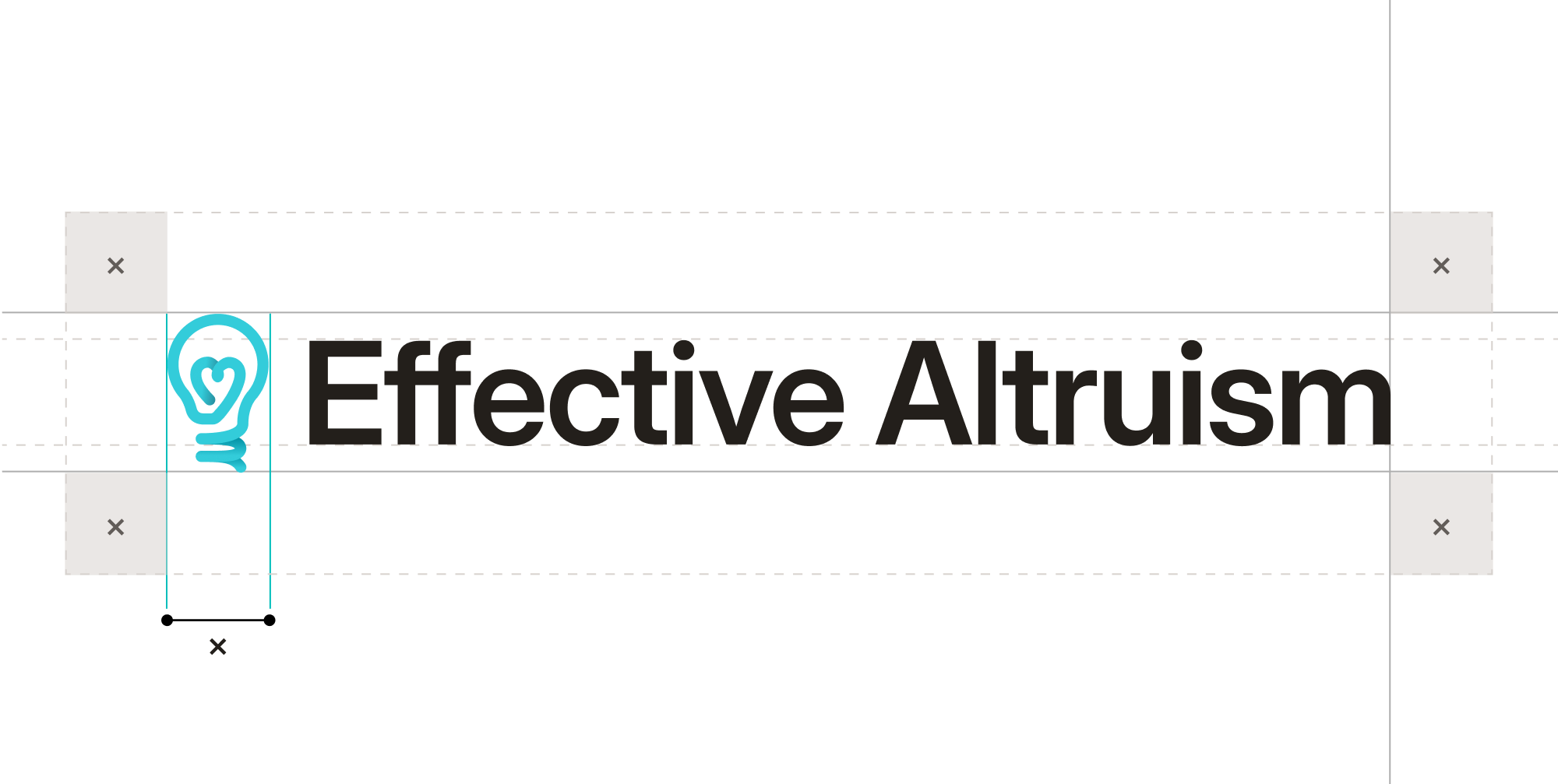
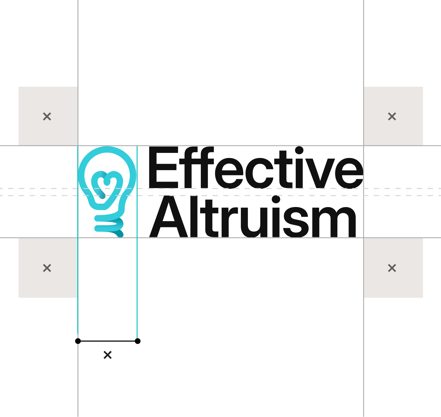
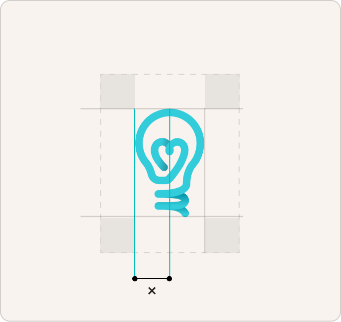
Give the identity room. Keep a margin of at least one symbol-width around every lockup, free of other logos, type and image edges. When in doubt, give it more.

Incorrect Usage

Do not diminish the identity. Avoid the following treatments.

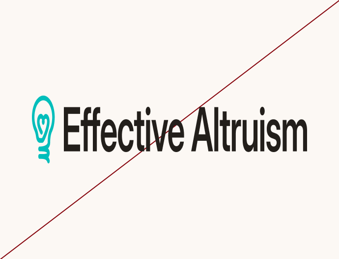
Image of brand logo incorrectly sized

Do not stretch or distort

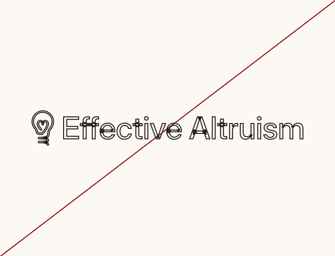
Image of brand logo incorrectly sized

Do not outline

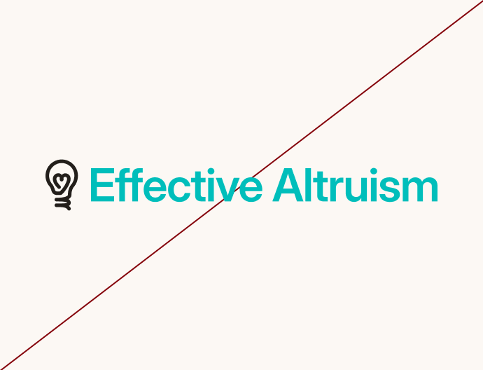
Image of brand logo incorrectly sized

Do not recolour the parts separately

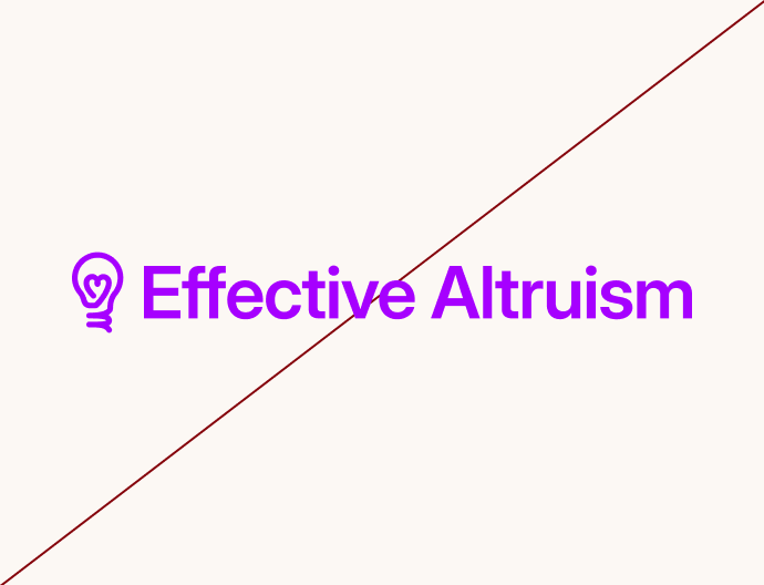
Image of brand logo incorrectly sized

Do not use unapproved colours

Image of brand logo incorrectly sized

Do not use low-contrast combinations

Image of brand logo incorrectly sized

Do not change the arrangement

Colour

Teal is EA’s signature colour. It works best against warm neutrals, which make up most of any page. Secondary colours come with the full guidelines.

Primary

Four colours do most of the work. Tropical Teal is the accent — buttons, links, the symbol. Deep Teal is the dark surface. Cream is the page and Ink is the text.

Tropical Teal

HEX

#00BEBB

RGB

0 / 190 / 187

Dark Teal

HEX

#003F3E

RGB

0 / 63 / 62

Cream

HEX

#FCF8F4

RGB

252 / 248 / 244

Ink

HEX

#231F1B

RGB

35 / 31 / 27

Extended Palette

Sky, Terracotta, Brick and Yellow support the core palette. Each has a full 12-step scale, shown here as Light (4), Base (9) and Dark (12)

Sky

HEX

#0E2FC3

RGB

14 / 47 / 195

Terracotta

HEX

#FF840E

RGB

255 / 132 / 14

Brick

HEX

#85030B

RGB

133 / 3 / 11

Yellow

HEX

#F7BC00

RGB

247 / 188 / 0

Type and Colour

Text is easiest to read when it contrasts strongly with what's behind it. The accessibility standard, WCAG AA, asks for a ratio of at least 4.5:1 for body text. These pairs pass:

Aa

Aa

Aa

Aa

Aa

Aa

Aa

Aa

Aa

Aa

Aa

Aa

Aa

Aa

Typography

Two typefaces working in pairing.

Inter↗ as the sans-serif workhorse for body, UI, and navigation, preserved from the existing system for its neutrality and legibility.

EB Garamond↗ as the serif companion for editorial moments, pull-quotes, and display headlines, replacing. Bringing the Forum and the global brand to the same page.

Weights in use

Type weight distinguishes levels of information without needing colour.

Inter

Regular

Medium

Semi Bold

Bold

EB Garamond

Regular

Medium

Semi Bold

Icons

Icons come from Font Awesome 7 Pro: Light and Regular weight, 1.5px stroke, rounded joints and terminals. Use them for wayfinding and lists, never as decoration, and never in cause colours outside cause content.

Examples in use

Download all assets

→

Effective Altruism brand essentials

These are the basics for using the Effective Altruism brand: the logo, the colours and the typefaces. They’re for anyone making something that carries the EA name.

The full guidelines, covering tone of voice, imagery and templates, are on the way. Until then, if you're not sure something fits, ask us before you publish.

Logo

The logo pairs the lightbulb symbol with the Effective Altruism wordmark. Use the full logo wherever there's room for it. Use the other versions only when the space calls for them.

Colour

The logo comes in two full-colour versions and one white version. Don't recreate it in any other colour, and don't change the teal of the symbol.

Scaling

The lockup is designed to stay clear at any size, from a 20px favicon to a conference banner. Always consider the audience, the channel and the tone: at large scale it can be the whole composition; at small scale it steps back and lets the content lead.

Clearspace

Give the identity room. Keep a margin of at least one symbol-width around every lockup, free of other logos, type and image edges. When in doubt, give it more.

Incorrect Usage

Do not diminish the identity. Avoid the following treatments.

Image of brand logo incorrectly sized

Do not stretch or distort

Image of brand logo incorrectly sized

Do not outline

Image of brand logo incorrectly sized

Do not recolour the parts separately

Image of brand logo incorrectly sized

Do not use unapproved colours

Image of brand logo incorrectly sized

Do not use low-contrast combinations

Image of brand logo incorrectly sized

Do not change the arrangement

Colour

Teal is EA’s signature colour. It works best against warm neutrals, which make up most of any page. Secondary colours come with the full guidelines.

Primary

Four colours do most of the work. Tropical Teal is the accent — buttons, links, the symbol. Deep Teal is the dark surface. Cream is the page and Ink is the text.

Tropical Teal

HEX

#00BEBB

RGB

0 / 190 / 187

Dark Teal

HEX

#003F3E

RGB

0 / 63 / 62

Cream

HEX

#FCF8F4

RGB

252 / 248 / 244

Ink

HEX

#231F1B

RGB

35 / 31 / 27

Extended Palette

Sky, Terracotta, Brick and Yellow support the core palette. Each has a full 12-step scale, shown here as Light (4), Base (9) and Dark (12)

Sky

HEX

#0E2FC3

RGB

14 / 47 / 195

Terracotta

HEX

#FF840E

RGB

255 / 132 / 14

Brick

HEX

#85030B

RGB

133 / 3 / 11

Yellow

HEX

#F7BC00

RGB

247 / 188 / 0

Type and Colour

Text is easiest to read when it contrasts strongly with what's behind it. The accessibility standard, WCAG AA, asks for a ratio of at least 4.5:1 for body text. These pairs pass:

Aa

Aa

Aa

Aa

Aa

Aa

Aa

Aa

Aa

Aa

Aa

Aa

Aa

Aa

Typography

Two typefaces working in pairing.

Inter↗ as the sans-serif workhorse for body, UI, and navigation, preserved from the existing system for its neutrality and legibility.

EB Garamond↗ as the serif companion for editorial moments, pull-quotes, and display headlines, replacing. Bringing the Forum and the global brand to the same page.

Weights in use

Type weight distinguishes levels of information without needing colour.

Inter

Regular

Medium

Semi Bold

Bold

EB Garamond

Regular

Medium

Semi Bold

Icons

Icons come from Font Awesome 7 Pro: Light and Regular weight, 1.5px stroke, rounded joints and terminals. Use them for wayfinding and lists, never as decoration, and never in cause colours outside cause content.

Examples in use

Download all assets

→

Effective Altruism brand essentials

These are the basics for using the Effective Altruism brand: the logo, the colours and the typefaces. They’re for anyone making something that carries the EA name.

The full guidelines, covering tone of voice, imagery and templates, are on the way. Until then, if you're not sure something fits, ask us before you publish.

Logo

The logo pairs the lightbulb symbol with the Effective Altruism wordmark. Use the full logo wherever there's room for it. Use the other versions only when the space calls for them.

Colour

The logo comes in two full-colour versions and one white version. Don't recreate it in any other colour, and don't change the teal of the symbol.

Scaling

The lockup is designed to stay clear at any size, from a 20px favicon to a conference banner. Always consider the audience, the channel and the tone: at large scale it can be the whole composition; at small scale it steps back and lets the content lead.

Clearspace

Give the identity room. Keep a margin of at least one symbol-width around every lockup, free of other logos, type and image edges. When in doubt, give it more.

Incorrect Usage

Do not diminish the identity. Avoid the following treatments.

Image of brand logo incorrectly sized

Do not stretch or distort

Image of brand logo incorrectly sized

Do not outline

Image of brand logo incorrectly sized

Do not recolour the parts separately

Image of brand logo incorrectly sized

Do not use unapproved colours

Image of brand logo incorrectly sized

Do not use low-contrast combinations

Image of brand logo incorrectly sized

Do not change the arrangement

Colour

Teal is EA’s signature colour. It works best against warm neutrals, which make up most of any page. Secondary colours come with the full guidelines.

Primary

Four colours do most of the work. Tropical Teal is the accent — buttons, links, the symbol. Deep Teal is the dark surface. Cream is the page and Ink is the text.

Tropical Teal

HEX

#00BEBB

RGB

0 / 190 / 187

Dark Teal

HEX

#003F3E

RGB

0 / 63 / 62

Cream

HEX

#FCF8F4

RGB

252 / 248 / 244

Ink

HEX

#231F1B

RGB

35 / 31 / 27

Extended Palette

Sky, Terracotta, Brick and Yellow support the core palette. Each has a full 12-step scale, shown here as Light (4), Base (9) and Dark (12)

Sky

HEX

#0E2FC3

RGB

14 / 47 / 195

Terracotta

HEX

#FF840E

RGB

255 / 132 / 14

Brick

HEX

#85030B

RGB

133 / 3 / 11

Yellow

HEX

#F7BC00

RGB

247 / 188 / 0

Type and Colour

Text is easiest to read when it contrasts strongly with what's behind it. The accessibility standard, WCAG AA, asks for a ratio of at least 4.5:1 for body text. These pairs pass:

Aa

Aa

Aa

Aa

Aa

Aa

Aa

Aa

Aa

Aa

Aa

Aa

Aa

Aa

Typography

Two typefaces working in pairing.

Inter↗ as the sans-serif workhorse for body, UI, and navigation, preserved from the existing system for its neutrality and legibility.

EB Garamond↗ as the serif companion for editorial moments, pull-quotes, and display headlines, replacing. Bringing the Forum and the global brand to the same page.

Weights in use

Type weight distinguishes levels of information without needing colour.

Inter

Regular

Medium

Semi Bold

Bold

EB Garamond

Regular

Medium

Semi Bold

Icons

Icons come from Font Awesome 7 Pro: Light and Regular weight, 1.5px stroke, rounded joints and terminals. Use them for wayfinding and lists, never as decoration, and never in cause colours outside cause content.

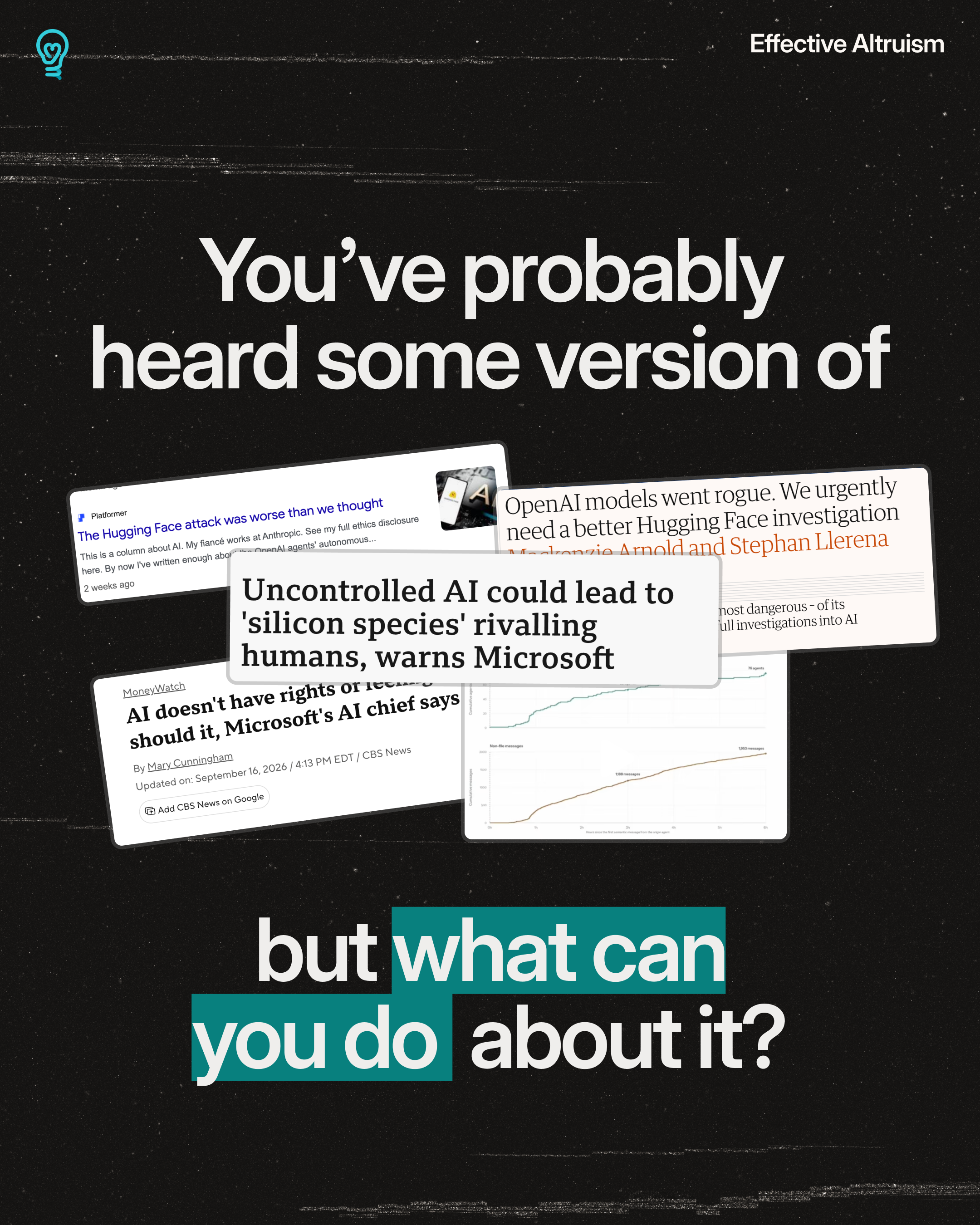
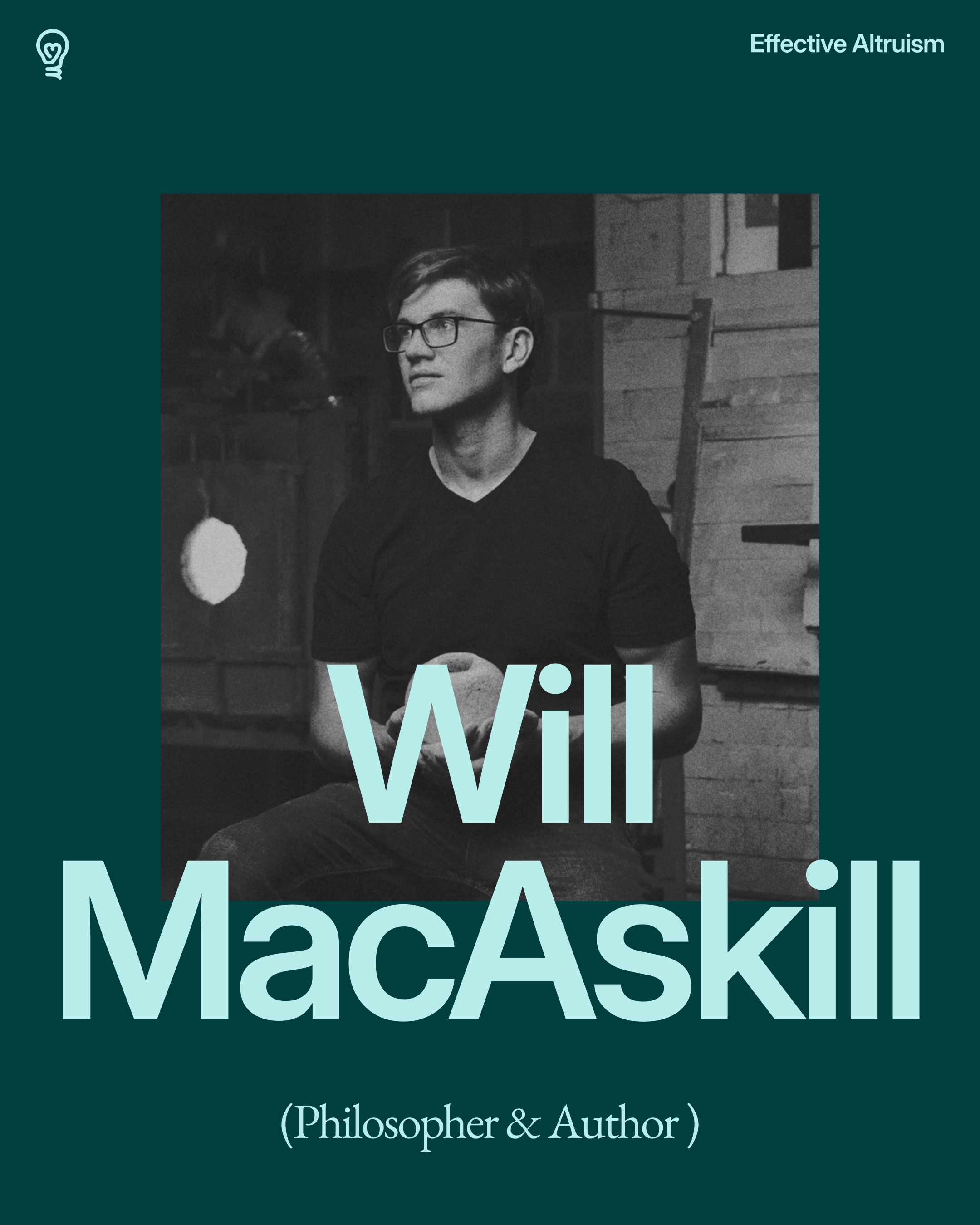
Examples in use